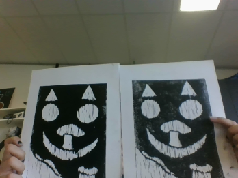
Bonjour, this term in art we have been looking at print making. We have created our own logo and made our own print and put it on paper. Here is my print. I really in joyed art and my favourite part was when we got to put it on paper. next time in art I think we should paint something. I like my print I think its very unique an amazing but the ink is uneven and there is arts that have to much ink and arts with not enough but overall its really cute. This logo is a lot about me because I like to paint mushrooms and I like cats. It also has my really ugly smile, my logo looks like the cat from Alice in wonderland. My logo design is a symbol cause it has no words or letters. I think that there is a an even amount of negative and positive space in my art.
Wednesday, 14 April 2021
1 comment:
To support my learning I ask you to comment as follows:
1. Something positive - something you like about what I have shared.
2. Thoughtful - A sentence to let us know you actually read/watched or listened to what I had to say
3. Something thoughtful - how have you connected with my learning? Give me some ideas for next time or ask me a question.
Subscribe to:
Post Comments (Atom)
Kia Ora Shanaya, Votre impression est fantastique! Your post is written well and and you have identified the type of logo design you've made. It has well defined positive and negative shapes and you have printed it well. The personal logo has a variety of shapes and symbols and they are arranged to create a portrait that is very cat-like. Tau kē! Next time, Do you think it would be interesting to make clay figures and then make a painting of the characters?
ReplyDelete